
Wednesday, December 18, 2013
Semester Final
Thursday, November 21, 2013


Thursday, November 14, 2013
Company Logo
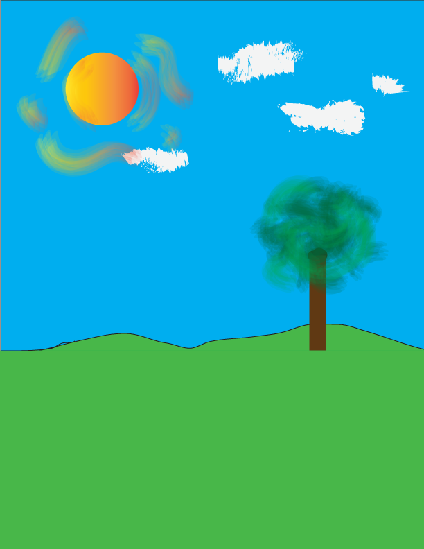
Wednesday, October 30, 2013
Friday, October 25, 2013
Halloween Poster

Thursday, October 24, 2013

Thursday, October 17, 2013
Pollution Advertisement

Tuesday, October 15, 2013
woof

Wednesday, October 2, 2013
Color Lyrics

Monday, September 30, 2013
Color theory
Color Theory Worksheet
Please read
the materials listed below and answer the following questions:
- Color Theory
Intro: http://www.nhsdesigns.com/graphic/color/index.php
- Color Wheel: http://www.nhsdesigns.com/graphic/color/color-wheel.php
- Color
Combinations: http://www.nhsdesigns.com/graphic/color/color-combos.php
- Tints, Shades
& Neutrals: http://www.nhsdesigns.com/graphic/color/tints_shades_neutrals.php
- Emotional
Content: http://www.nhsdesigns.com/graphic/color/emotional-content.php
- Color Meaning: http://www.color-wheel-pro.com/color-meaning.html
- Color Physiology: http://www.webdesign.org/web-design-basics/color-theory/color-psychology-quick-reference-cards.13826.html
Please type
out answers in complete sentences. You
may paraphrase. Please do NOT copy and
paste definitions.
- Define hue: What distinguishes one color from another
- Define value: relative lightness or darkness of a color
- Define saturation: the rough equivalent of brightness
- How many colors are available on our
computers?
- Define secondary color: two primaries mixed together
- Define tertiary color: primary plus a neighboring secondary
- Define complementary colors: colors that sit opposite of each other
on the color wheel
- What are the primary colors in
Photoshop? Red green and blue
- What are the secondary colors in
Photoshop? Cyan, magenta, yellow
- Define subtractive color model: colors that when mixed together make
black
- Define additive color model: colors that when mixed together make
white
- Is RGB additive or subtractive? additive
- Is CMYK additive or subtractive? subtractive
- What is the RGB color model used
for?
- What is the CMYK color model used
for?
- Define analogous colors: Colors that sit next to each other on the
color wheel
- Define tint: A color in which white has been added to
- Define shade: a color which
black has been added to
- Define neutral: a combination of complementary colors
- What can be said in general about
warm colors? They jump out and are usually prominent
- What can be said in general about
cool colors? They recede in a design
- What color is associated with
stability? blue
- What color symbolizes royalty? purple
- What is the color of cleanliness?
white
- What color symbolizes freshness? green
- Which colors are associated with
joy? yellow
- What color symbolizes passion and
danger? Red
- Dark red is associated with: Anger
courage, vigor
- Reddish-brown is associated with:
harvest and fall
- Dark orange is associated with: deceit
or distrust
- Gold is associated with: wisdom,
prestige.
- Yellow is associated with: joy, happiness energy, intellect
- Dark green is associated with: ambition,
greed, jealousy
- Olive green is associated with: color
of peace
- Light blue is associated with: health,
tranquility, understanding
- Dark purple is associated with: gloom and
sad feelings
- Why is the use of color important
in graphic Design? It determines what feelings your picture evokes.
Thursday, September 26, 2013
One-word art

Tuesday, September 24, 2013
Typography Quote

Monday, September 23, 2013

Friday, September 20, 2013
Glyph Monster

Thursday, September 19, 2013

Tuesday, September 17, 2013
Typography Worksheet
 Typography Worksheet:
Write out the answers to these questions in complete
sentences.
Label and define all of the above numbers:
1. The ascender line determines the height of the ascenders.
2. The base line, where all the letters rest. If a letter goes below this line it is a descender.
3. The ascender height is the distance between the base line and the ascender line.
4. The cap height is the height of the capital letters; the distance between the base line and the cap line.
5. The descender is the stroke of a character that comes down below the base line.
6. The ascender is the part of the character that comes above the mean line.
7. The distance between the base and the mean line. Rounded letters such as g and o extend beyond these lines.
8. The cap line is the line that determines the height of capital letters.
9. The mean line is the line that determines the height of lowercase letters.
10. The descender line determines the bottom reach of descenders.
Define Serif: The design at the end of a stroke.
Define Sans-Serif: A type of text with no serif.
When do you use Antique Fonts? -When you want to provoke a nostalgic or period feel you should use them.
At most how many words should be Decorative Fonts at a time? –No more than three at one time.
What does a script font resemble? –Scrip fonts resemble hand writing.
What element of design does script represent? (From elements lesson) -lines
Why use Symbol Fonts? –To provide embellishment and complement other specific fonts.
Define Typography: The art of arranging type for media
purposes.
Why do designers need a solid foundation in typography?
Kerning: Adjusting the space between letters or characters
Leading: The space between the lines of text.
Tracking:
Why do designers need a solid foundation in typography?
Kerning: Adjusting the space between letters or characters
Leading: The space between the lines of text.
Tracking:
When do you use the following?
Center Alignment:
Right Alignment:
Justified Alignment:
Center Alignment:
Right Alignment:
Justified Alignment:
What is remembered: good styling or bad styling? Good
typography is easy to read but bad typography is memorable.
What is legibility? The ability to read typography.
Type size smaller than 7pt is: Difficult to read
Type size smaller than 3pts is: Utterly illegible.
Type range for legible type is: between 8pt and 14pt. 9 and 10 are the best choices usually.
What do you use for long passages? A serif font
What case do we use for Body? Both upper and lower
What is measure? The width of the text column.
What can you tell me about Ragged Edges?
What are some ways text can be used and what font types do
you use for each?
Text can be used to make designs and lines. You can organize the bodies of text into patterns or you can form lines with the words. Different sizes can create different lines.
Text can be used to make designs and lines. You can organize the bodies of text into patterns or you can form lines with the words. Different sizes can create different lines.
**Read ALL of it.
Answer the following:
Why is choosing and using the right font important? (Two
reasons) It is what gets the readers attention and persuades them. It
determines what mood the reader thinks the idea is set in.
What are the two most important things to remember? The type should not overpower the text and
there are no bad typefaces, just appropriate and inappropriate typefaces.
What is appropriate? What do you have to consider? Anythig legible by anyone with any eyesight in any lighting. You should consider the mood you are trying to convey and who you want the type to appeal to.
What is appropriate? What do you have to consider? Anythig legible by anyone with any eyesight in any lighting. You should consider the mood you are trying to convey and who you want the type to appeal to.
Tell me the rules: (there
are 10)
1: body text should be between 10 and 12 point.
2: Use enough leading. Always add at least one or two points
more than the type size.
3: Don’t make your lines too short or too long.
4: Make paragraph beginnings clear. Use either an indent or
a block style.
5: Use only one space after a period, not two.
6: Don’t justify text unless you have to.
7: Don’t underline anything, especially not headlines or
subheads.
8: Use italics instead of underlines.
9: Don’t set long blocks of text in italics, bold, or all
caps.
10: Leave more space above headlines and subheads than
below.
Thursday, September 12, 2013
Rain Drop
This was a really tricky project. The hardest part was layering and using the minus front tool. I used multiple brush strokes when using the splatter brush but I still couldn't make the specs looks as good as I wished they would be.

Thursday, September 5, 2013


Monday, September 2, 2013
Subscribe to:
Comments (Atom)